
We’ve looked at several sites, both within and outside the nonprofit sector, to gather some solid ideas on what works best. Unlike many articles that just highlight pretty designs, this post will dive deeper into what makes the best nonprofit websites effective and engaging. We want to give you practical advice for building a website that truly reflects your mission and goals. There’s a lot to cover, so let’s get started.
Stand Together
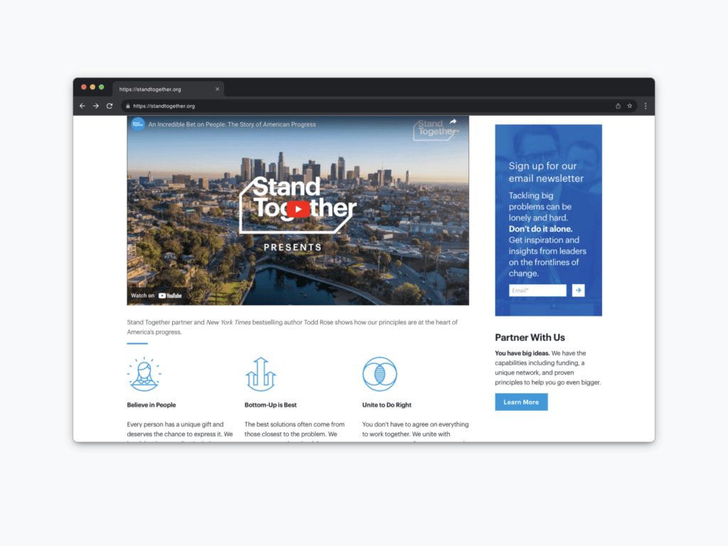
Let’s start with the Stand Together website. When you land on their homepage, you’re immediately greeted with a bold and visionary statement. Forget about sliders—just present a clear mission that instantly communicates your purpose. For example, Stand Together’s homepage features a powerful message about empowering people to solve America’s biggest problems, making it super easy for visitors to grasp what they’re all about.
High-quality, emotionally engaging videos can do wonders for your website. Stand Together nails this with videos that clearly and compellingly convey their mission and impact. Think about creating short videos that capture your organization’s essence, making it memorable for your audience. A well-produced video can really help visitors connect with your cause.
Using simple icons and clear language is crucial. Stand Together uses concise statements like “Believe in People” and “Unite to Do Right,” paired with complementary icons. Avoid mismatched or overly complex icons that might confuse your visitors. Consistency in design and messaging across your site will strengthen your overall impact.
Habitat For Humanity
The next website to consider is Habitat for Humanity. This organization has an excellent nonprofit website with a very clean, crisp, and organized design. Beyond its visual appeal, there are a few key elements to take note of for your own nonprofit website.
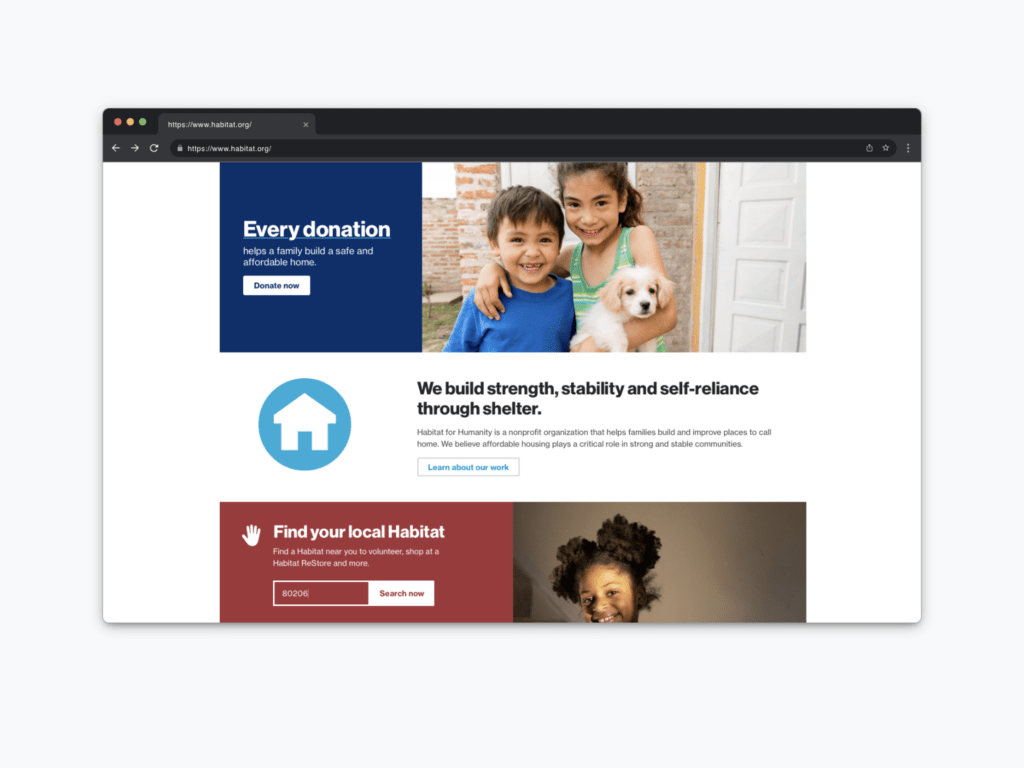
One of the standout features of Habitat for Humanity’s website is its use of authentic images. Prominent, real-life photos can significantly emphasize the impact of every contribution. For example, Habitat for Humanity pairs a message like “Every donation helps a family build a safe and affordable home” with a genuine image of the people they serve. This combination is incredibly powerful—like peanut butter and jelly—creating a compelling call to action for donations. So, ensure that your donation appeals are supported by authentic visuals.
Another valuable feature is the tool that allows users to quickly find local locations. This is particularly useful for larger nonprofits with multiple branches. Consider adding a zip code location finder on your homepage and other key sections. This feature helps potential volunteers, donors, or visitors easily locate and engage with your local branches. If your nonprofit has stores or multiple locations nationwide, this tool can significantly enhance user experience and participation.
The California Endowment
The third website, and my personal favorite example, is the California Endowment. This site masterfully combines visuals and messaging to create an impactful online presence.
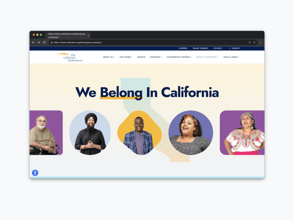
The California Endowment uses a diverse range of images that reflect the community it serves. This is crucial for highlighting the organization’s impact on various groups. They use different people, shapes, and colors to signal inclusivity and belonging in the state of California right from the homepage. When planning your website’s imagery, ensure it mirrors the diversity of your community.
Another standout feature is their use of fun design elements. These don’t have to be overly youthful but should showcase vibrant images and energy that appeal to your audience. Incorporating such elements can keep the design engaging and make your site more inviting.
A more useful feature of the California Endowment website is its sticky navigation. This is especially useful for long pages, like the About Us section, where detailed narratives about your mission, vision, and values can get lengthy. A sticky navigation bar remains visible as users scroll, making it easy for them to jump to different sections without getting lost. This enhances user experience by allowing visitors to find information quickly without endless scrolling.
Lastly, ensure that your content is easy to skim. The California Endowment does this well with simple, clear messages that effectively communicate their impact and mission. For example, their statement “Every aspect of our life impacts our health” is concise and backed up with quick, supportive content. By making your content skimmable, you allow visitors to grasp the essence of your organization without feeling overwhelmed by lengthy text. People prefer quick, digestible information, so keep your messages brief and to the point.
Lemonade
Let’s take a brief sidetrack from our main topic to discuss an important aspect that significantly engages donors and volunteers: impactful landing pages. While we’re focusing on nonprofit websites, it’s essential to note that creating landing pages with powerful content can make a huge difference.
To truly engage donors and volunteers, consider developing landing pages that showcase compelling pieces of content like impact reports or annual reports. Start with a strong message and use animations or interactive elements to guide users through your achievements and community contributions.
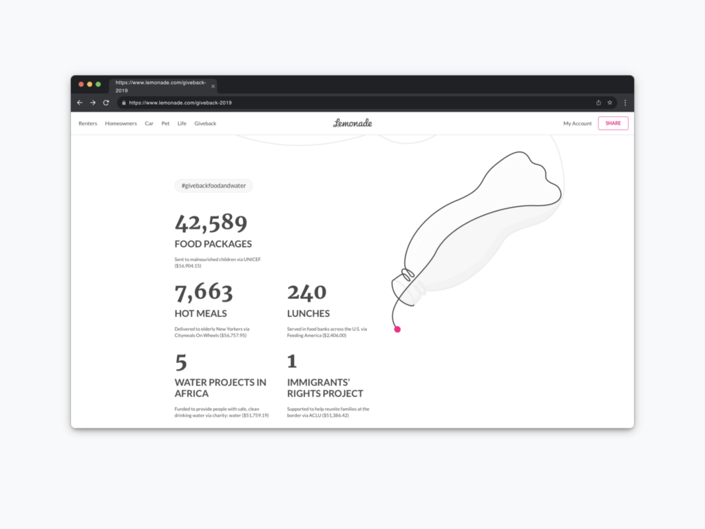
A great example of this approach is the website for Lemonade. As users scroll through the site, they are taken on an animated journey that seamlessly communicates the company’s impacts. By incorporating these elements, you create landing pages that are not only informative but also visually engaging and memorable. This approach isn’t about adding flashy elements for the sake of it; it’s about effectively communicating your organization’s impact in a way that resonates with your audience.
Use these landing pages to highlight key accomplishments such as:
- Environmental sustainability efforts
- Job creation initiatives
- Community investments
- Hunger relief partnerships
- Volunteer hours and constituency engagement
Metrics-driven content can be particularly engaging, as it provides concrete evidence of your organization’s impact. Present these achievements in a visually appealing way that grabs attention and makes the information easy to digest. Remember, visitors may not read every word or scrutinize every detail, but the overall impression they get is crucial. The combination of compelling visuals and succinct, impactful information can leave a lasting impression on donors and volunteers, making them more likely to engage with your organization.
Salvation Army
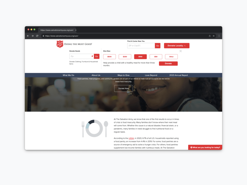
Alright, back to nonprofits. Another excellent website to draw inspiration from is the Salvation Army. Many large nonprofits have a similar feel, but the Salvation Army stands out with some particularly strong features.
The Salvation Army’s website utilizes a robust top-level navigation system. They understand that people don’t want to hunt for information, especially when it comes to making donations. Their site offers a simple, intuitive way for users to donate locally, with clear options for different types of donations and preset amounts for quick selection. This approach minimizes decision-making and reduces barriers, making it easy for visitors to support their cause. For instance, a straightforward option like, “Donate $100 to provide healthy meals for children for three months,” makes it easy for donors to take action with a clear understanding of their impact.
Beyond just monetary donations, the Salvation Army’s site directs visitors to various ways they can engage with the organization. Whether it’s donating goods, finding a nearby center through a zip code search, or offering services, the site makes it easy for users to get involved in multiple ways.
Another standout feature is how the website helps visitors quickly identify their needs and directs them to the appropriate resources. Instead of generic labels like “Chat” or “Help,” they use the more engaging prompt, “What are you looking for today?” This prompt is followed by a quick pop-up that asks, “Do you want to get help or provide help?” This simple, conversational approach guides users to the right resources and actions based on their needs, making the interaction feel more personal and user-friendly.
Good360
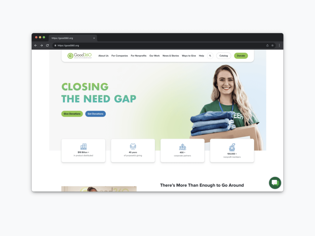
Another nonprofit website to draw inspiration from is Good360. Their site does an excellent job of providing clear paths and essential information for users. Let’s dive into what makes their website stand out.
Good360 excels in offering straightforward options for users to either give or get donations. Their site makes it easy for visitors to navigate directly to the desired action, whether it’s donating or requesting donations. This clear segmentation helps users quickly find what they need without confusion.
Good360 effectively uses statistics to highlight their impact. This allows users to quickly skim and understand the organization’s achievements and overall impact. Including clear, concise statistics on your website is a great way to convey your nonprofit’s successes and build credibility.
Another strong feature of Good360’s site is the detailed list of acceptable and non-acceptable donation items. This visual guide helps answer common questions upfront, making it easier for users to interact with the organization. Consider providing a well-organized and visually appealing guide on your site to help users understand how best to contribute.
Good360 anticipates what users might want to know next. By thinking ahead and addressing potential questions, they enhance the user experience. For instance, if users are looking to donate goods, the site clearly outlines what can be donated. This proactive approach minimizes confusion and improves user satisfaction.
Good360 strategically places impactful messages throughout their site without overwhelming users. Instead of using large, space-consuming sliders that add little value, they incorporate text and visuals in a balanced way to communicate key messages about community impact and sustainability efforts. This ensures that important information is conveyed effectively without cluttering the site.
Savers
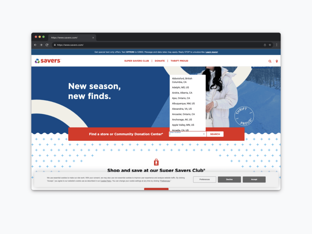
While Savers may not be a nonprofit, there are several things they do exceptionally well that nonprofits can learn from. Sometimes, it’s beneficial to look at successful practices from the for-profit world and apply them to your nonprofit. Here’s what Savers does right and how you can incorporate these strategies into your nonprofit website.
Savers makes it incredibly easy for visitors to find a store or donation center right from the homepage. This user-friendly feature simplifies the process, ensuring that visitors can quickly locate the nearest location to either shop or donate items. For your nonprofit, think about how you can streamline navigation to help users find key information or actions, like finding a local branch or making a donation, as effortlessly as possible.
Another important feature on Savers’ website is their cookie consent form. While it might seem like a minor detail, it’s crucial for informing users about your use of cookies and tracking technologies. This not only helps build trust but also ensures your website is GDPR compliant. There are plenty of CMS plugins available that can help you implement this on your site, making sure your users are informed and their data is protected.
Savers uses short, impactful videos to convey important messages. For example, a 16-second video on their site highlights the environmental impact of the clothing industry and promotes sustainable fashion. This approach effectively tells a story by setting up the situation, providing context, and offering a solution. Nonprofits can leverage similar techniques to create engaging, educational content. Tools like OpenAI’s video creation platform can help you produce these videos cost-effectively, enhancing your website and social media presence.
Intercom
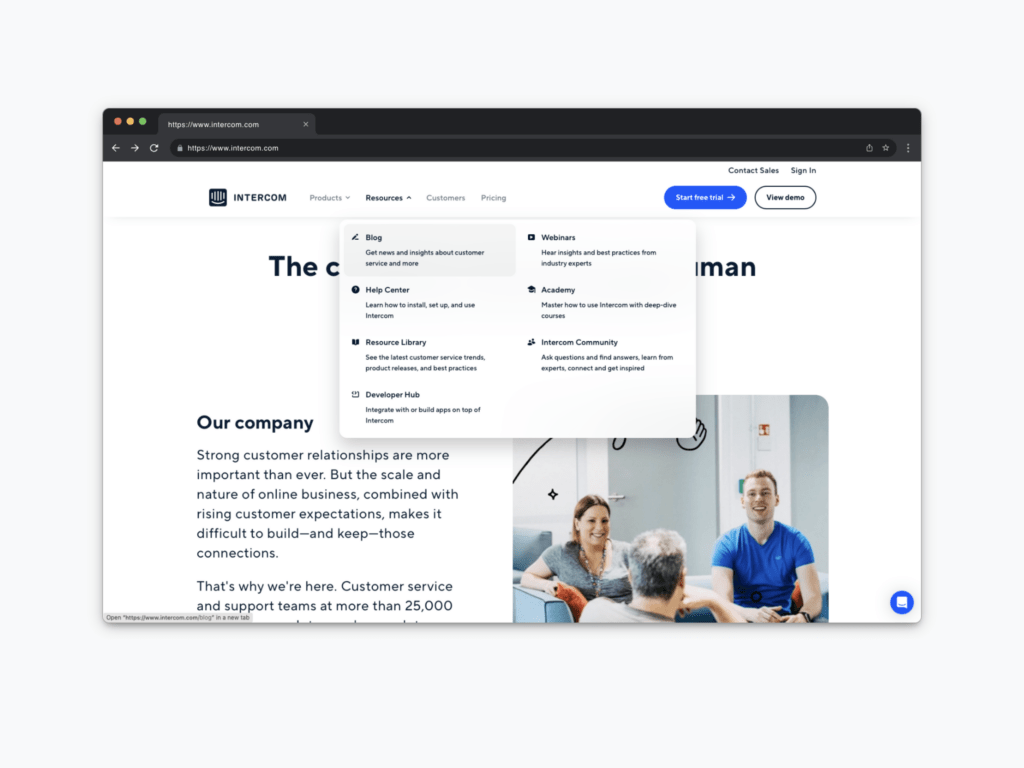
Let’s explore a different angle. As I mentioned before, it’s beneficial for nonprofits to look beyond their sector for inspiration.
Instead of using outdated, flat dropdown menus reminiscent of 1990s software, aim for vibrant and descriptive dropdown menus that are easy to navigate. These menus should offer clear information without overwhelming users. For instance, take a cue from Intercom’s website. Their menus provide a quick understanding of what each section offers, like “Webinars,” “Resource Library,” or “Help Center.” Avoid using internal jargon that outsiders might not understand. Instead, include short descriptions under each menu label to clearly explain what each section is about.
Intercom effectively uses social proof by showcasing testimonials and reviews from various platforms to build trust and demonstrate the impact of their work. Your nonprofit can do the same. Pull reviews and testimonials from your social media platforms like Facebook, Instagram, LinkedIn, or even TikTok. Highlight these real-life experiences to show the positive impact of your organization. Curate a list of these testimonials and, if possible, link them back to the original reviews to add credibility.
Avoid getting bogged down in organizational jargon. Make your website accessible to everyone by using clear, simple language. For each program or section, provide concise explanations so visitors can quickly understand what your nonprofit offers. This makes your website more user-friendly and helps potential supporters and beneficiaries find the information they need without confusion.
ThredUp
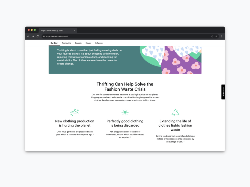
Let’s explore another example from outside the nonprofit sector: ThredUp. This retail outlet provides valuable lessons for nonprofits, especially in how to effectively communicate a sustainability message.
ThredUp excels at promoting their sustainability message. They educate users about the environmental benefits of thrifting and encourage them to join the movement against fast fashion. Their dedicated landing page elaborates on the environmental benefits of participating in the circular fashion economy, using compelling narratives and data to illustrate the positive impact of clothing reuse. This approach can be incredibly effective for nonprofits looking to communicate their social and environmental missions.
ThredUp’s landing page is a masterclass in educating visitors. It explains complex concepts in simple terms, making it easy for users to understand the environmental impact of their actions. Nonprofits can adopt this strategy by creating similar educational content that highlights the importance of their cause and the impact of individual contributions.
One of the most innovative features on ThredUp’s website is their environmental impact calculator. This tool allows users to see the tangible effects of their clothing donations, making the environmental benefits clear and personal. Nonprofits can implement similar interactive features to engage users and show the direct impact of their support. This not only educates users but also encourages deeper engagement with the organization.
By providing tools like the impact calculator, ThredUp encourages users to become more involved with their mission. For nonprofits, such features can help convert casual visitors into dedicated supporters or volunteers. These tools should be seen as a secondary priority after establishing clear and compelling core content, but they can be highly effective in fostering long-term engagement.
Doctors Without Borders
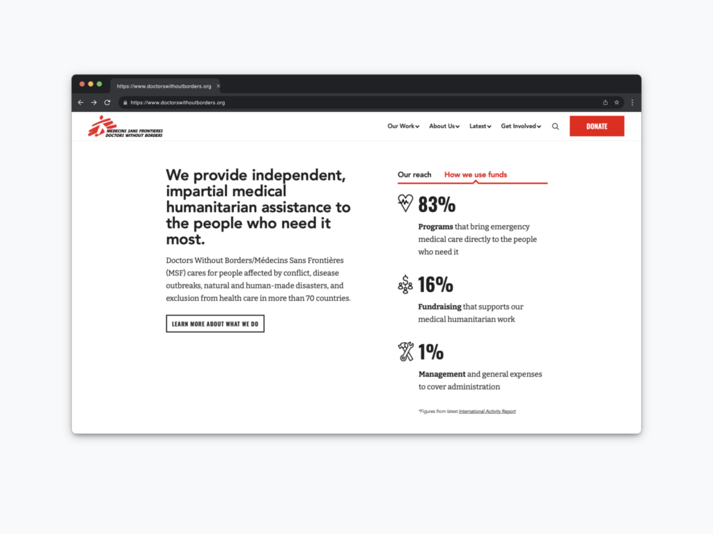
The next website to consider for inspiration is Doctors Without Borders. Beyond their impressive design, their messaging is exceptionally timely and relevant, addressing current global and local issues effectively.
Doctors Without Borders excels in delivering timely messages that resonate with current societal needs. Their calls to action are clear and compelling. For your nonprofit, consider how you can tie your messaging to current events or local conversations. Highlight the problem and clearly state how your organization is addressing it. This approach makes your mission relatable and urgent.
One common mistake nonprofits make is complicating how they present their fund allocation. Potential donors and volunteers are unlikely to sift through detailed annual reports. Instead, make it straightforward and transparent. Doctors Without Borders does this exceptionally well, clearly stating how donations are used:
- 83% of funds go directly to emergency medical care.
- 16% supports fundraising efforts.
- 1% covers general management and administration fees.
Such transparency reassures donors that their contributions are making a significant impact. Consider using simple, consistent statements across your website to show how funds are utilized. This builds trust and encourages ongoing support.
Doctors Without Borders repeats their key financial transparency messages across multiple sections of their site, not just on the homepage. This repetition ensures that visitors frequently encounter these important details, reinforcing trust and clarity. Apply this strategy by placing key statements about your mission and fund usage in various sections of your site, ensuring they are easily seen and understood.
The Nature Conservancy
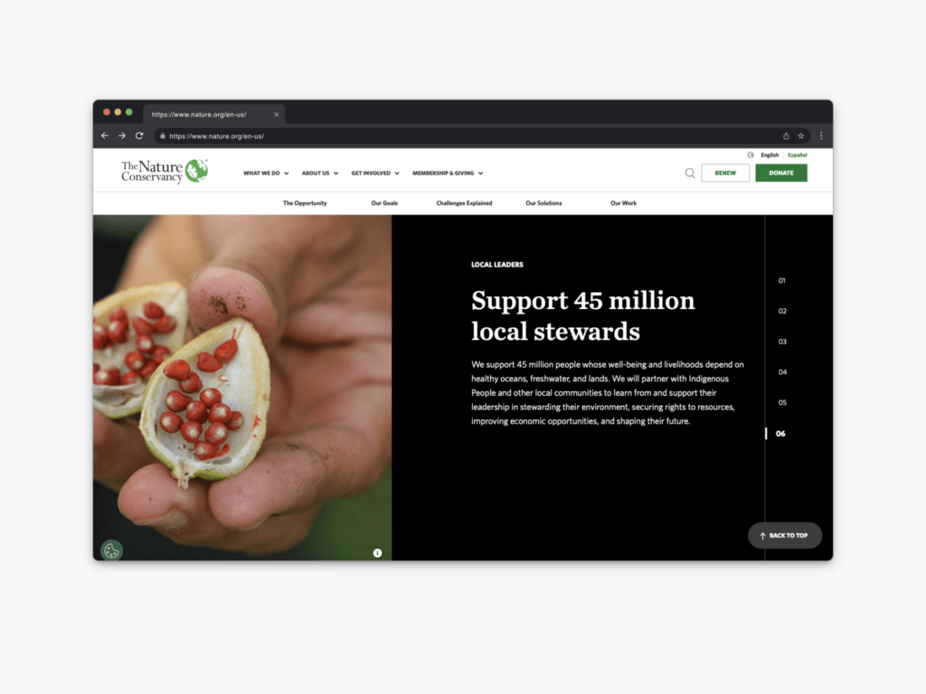
The last website I want to highlight is the Nature Conservancy. This site not only has an attractive design but also effectively presents the organization’s powerful goals.
The Nature Conservancy does an excellent job of showcasing their ambitious goals for 2030, laying out six critical objectives in a way that is easy to read and understand. These goals are accompanied by visuals, making them engaging and accessible. For your nonprofit, don’t hesitate to prominently display your goals on your website. This transparency shows donors, volunteers, and staff where you’re headed and the big problems you’re aiming to solve, demonstrating a clear strategic plan.
The Nature Conservancy makes it easy for people to see themselves in the work they do by using direct language and inviting visuals. Calls to action like “Visit a Nature Preserve,” “Volunteer with Us,” “Take an Action Pledge,” and “Attend an Event” are straightforward and compelling. Ensure your website includes similar direct calls to action and visuals that allow potential supporters to envision their involvement.
They also use video effectively to discuss the impact of their work and the activities they’re engaged in. Videos provide a dynamic way to communicate your mission and give visitors an immersive understanding of your efforts. Consider incorporating videos that highlight your organization’s impact and future goals, setting clear expectations for viewers.
Lastly, the Nature Conservancy uses vertical scrolling for some of their content, rather than the traditional horizontal sliders. This approach feels fresh and modern, similar to a PowerPoint or Keynote presentation. Experiment with different visual formats that people are familiar with in their everyday lives to enhance engagement and interactivity on your site.
###
So, that wraps up our exploration of effective nonprofit websites. I hope you’ve gained valuable insights into key elements to consider for your own site. If you need assistance putting these ideas into action, we’re here to help.
We have a fantastic website planning sheet that you can access here. Additionally, feel free to reach out to us for a conversation about your needs. We’re passionate about working with nonprofits and would love to help you create a website that truly serves your organization’s mission.
Whether it’s planning, design, or implementation, our expertise in the nonprofit sector can help you achieve your goals. Let’s collaborate to create something meaningful for your organization.